AI STRATEGY – AUTOMATIONS EXPERT – CUSTOMER EXPERIENCE DESIGN
myki App – Vic Transport
AI - Consultancy - Lean UX Research - MVP Strategy - UX Design Thinking™
00-01
Overview
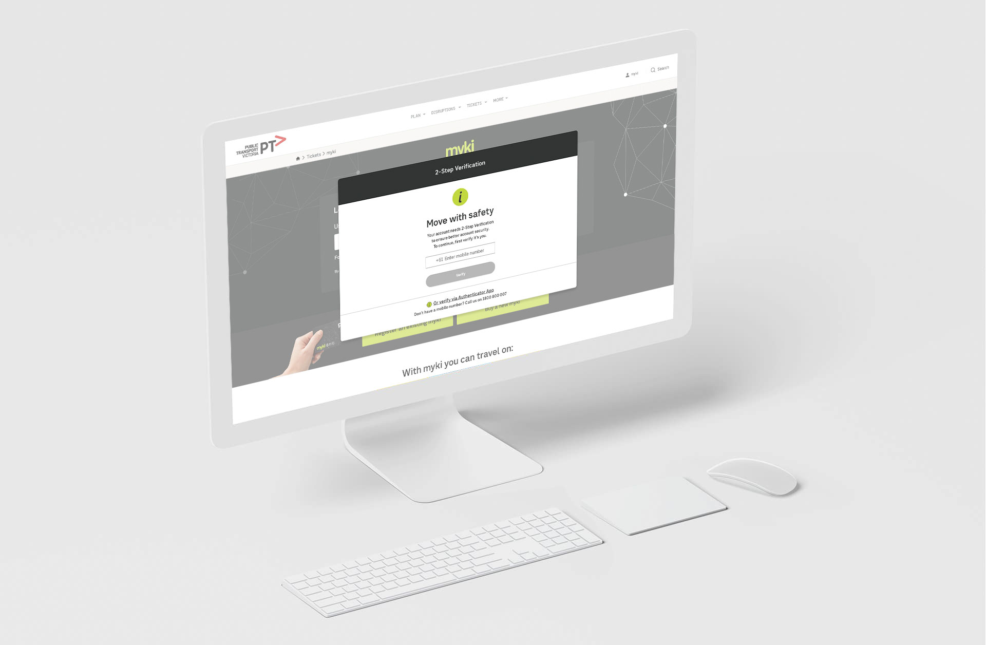
Build secure, seamless constituent experience.
How we designed a layer of security to help people build a life free from frustration.
Expertise
Agile Planning, Lean Product Design, Brand Experience Design, UX Design Thinking™
Sector
Public Services & Transport Department
Platforms
iOS, Androind, Web 2.0
Services
- Consultancy
- Wireframes & Prototypes
- User Interface Design
- Responsive Web Design
- Interactive Design
- UX Testing & Reporting
Myki is a reloadable credit card-sized contactless smart card ticketing system used for electronic payment of fares on most public transport services in Melbourne and regional Victoria, Australia.
Myki replaced the Metcard ticketing system and became fully operational at the end of 2012.
00-02
Project Timeline
Map out your project plan.
See how tasks and deadlines connect, so we can identify problems and fix dependency conflicts before we start.
A project timeline is a visual list of tasks or activities placed in chronological order, which lets project managers view the entirety of the project in one place.
A project timeline typically takes the form of line graph and it can be used to show how something changes over time. They have an x-axis (horizontal) and a y-axis (vertical). Usually, the y-axis has weeks for the time period, an the graph line indicates each task and it’s given name.

00-03
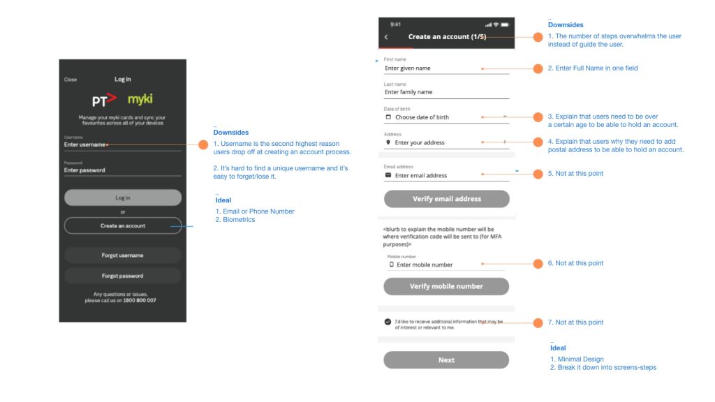
Expert Analysis
I flaged and scored the flows using colour coded keys and presented in a short paragraph the pain-point and the posible solutions.
It accelerates the design process and builds bridges between teams working in concert to bring products iteration to life.
Grey – Small-scale problem only; Such an issue doesn’t need to be fixed unless sufficient time is available on a project.
Yellow – Minor Usability Problem This is a low-priority issue that is less important to fix.
Orange – Major Usability Problem This is a high-priority issue that it is important to fix.
Red – Critical Usability Problem It is imperative to fix such an issue before releasing a product.
00-04
Strategy
2-Factor Authentication vs
Multi-Factor Authentication vs
Adaptive MFA.
The world is on the move, and your end users are no exception. But what authentication strategy fits your needs?
2-Factor Authentication (2FA)
Users must supply another, secondary factor after the primary factor (typically
a password) to prove identity.
• Potential gaps: Only one additional layer of identity assurance with limited flexibility. Plus, it can be annoying to the end user to always require
a second factor.
Adaptive Multi-Factor Authentication (AMFA)
A flexible system for prompting for additional identity assurance. Okta’s Adaptive MFA solution determines when to prompt for step-up authentication prior to granting access based on
device and user context. Prompts are dynamic
based on user and device context to prevent over-burdening the end user.
Multi-Factor Authentication (MFA)
You prompt the user and grant access based on a spectrum of possibilities, including inside/outside corporate networks, blacklisted/whitelisted sets of IPs, and application policies. You can set this up based on multiple data points and factors derived from login attempts, such as third-party tokens, biometrics, and SMS.
• Potential gaps: Static rules may not be as flexible and can still overburden the end user; does not surface unusual authentication behavior.

00-05
User Journey & Product Roadmap
Authentication is one of the essential components of security.
It is one part of the concept known as authentication, authorization, and accounting.
Authentication is the process of claiming an identity then proving that you are that claimed identity. Authorization is the mechanism to control what you can access or do.
Accounting is the recording of events into a log to review the activities against the rules and policies in order to detect violations or confirm compliance.
All three of these should be addressed when constructing a system in order to have a reasonable foundation for reliable security.

00-06
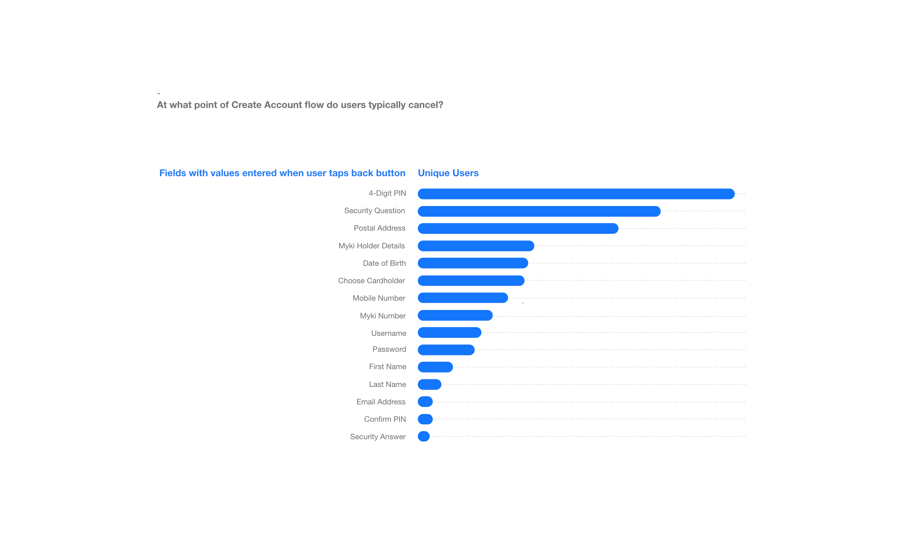
Data-science
Data is not only about measuring the past.
Data visualization can be a tool for prediction and intervention of the future.
The much-discussed “flatten the curve” graphic which circulated in the early stages of the pandemic is a great example of how a visualization can communicate the risks of inaction.
Data simulation can help us confront large-scale, complex issues like the economy, health, and climate change by modeling the likely outcomes of various courses of action.
—More Projects
©2025 LUIZ FLAVIO ALL RIGHTS AND WRONGS RESERVED :)